
The more wild movements stock markets make, the more we tend to notice how random those movements can be. With all the sound and fury, highs and lows, crossed signals and contradictory conversations, it’s been especially hard to think straight about them year-to-date.
Fortunately, we have a useful illustration to help dial down the drama and put this year’s volatility into big-picture context.
In this case, our big picture is what we refer to as the “quilt chart.”
Exhibit 1: Quilt Chart
Asset Class Performance, 2000—2019
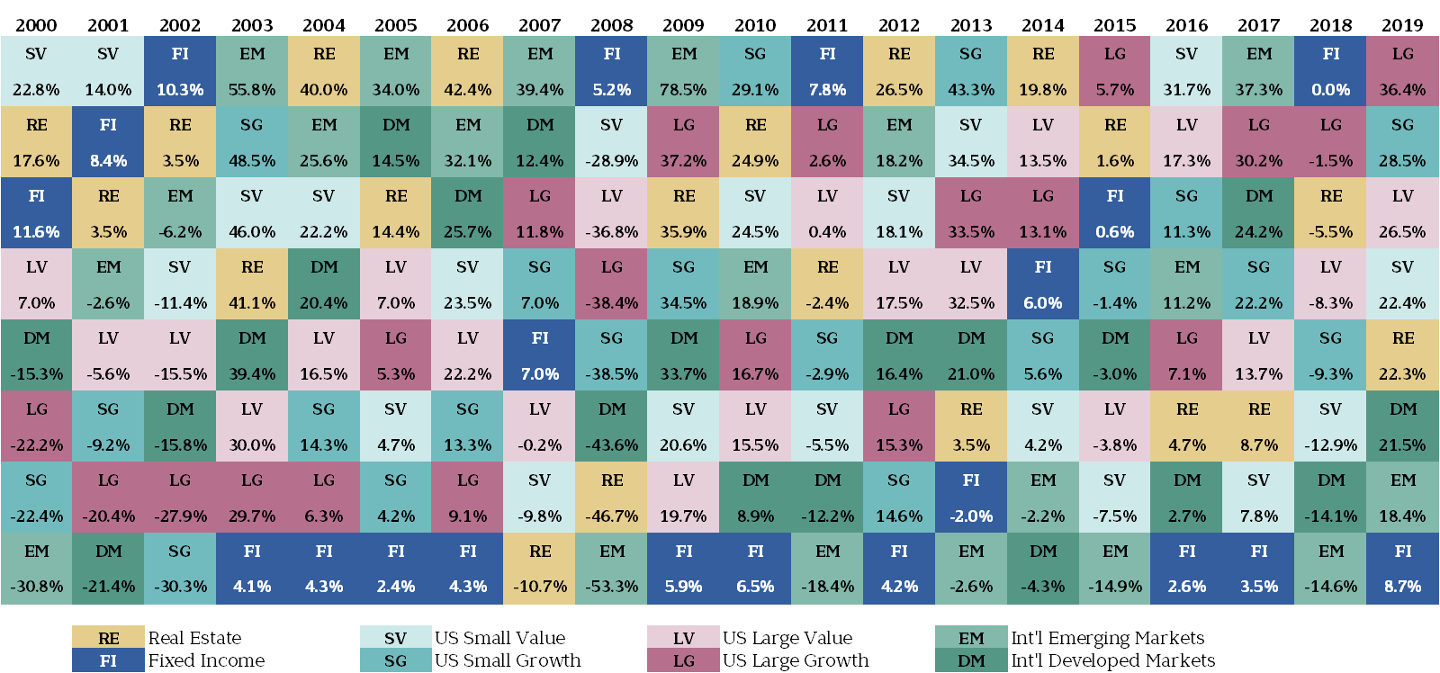
Here’s how it works: Each vertical column is a year. Each color is an asset class. For example, real estate is gold, U.S. small-cap growth stocks are aqua, and so on. For each column-year, we stack best- to worst-performing asset classes top to bottom. So, in the 2000 column, U.S. small-cap value stocks offered the top annual performance at +22.8%; international emerging markets stocks offered the worst, at –30.8%.
It’s called a quilt chart because the results always end up looking like a random blanket of colors. We’ve been updating this chart for years, and it’s never lost its effectiveness for helping clients visualize three key messages.
1. Chasing past performance is an unhealthy pursuit.
With gyms restricted if not still closed, many of us have been coming up with creative ways to stay in shape. Unfortunately, chasing after last year’s winning asset class is not an advisable exercise.
In fact, as our quilt chart conveys, there may be few faster ways to lose investment muscle. One year’s best performer can readily be the next year’s worst. Just look at emerging markets, returning +37% in 2017 and –14% in 2018. Or consider real estate’s rise and fall in 2006 (+42%) and 2007 (–11%).
2. Perceived patterns can deceive.
It’s also pointless to alter your investment strategy based on seemingly significant multi-year patterns. Just as toilet paper is now America’s hottest commodity after years of thankless service, so too can any given asset class be on a tear or adrift for years, only to reverse course on an unexpected dime.
Look at the quilt chart to see the long, purple losing streak for U.S. large-cap growth stocks in 2001–2006. At the time, the S&P 500 was more than halfway through what would become a “lost decade” of negative total returns. We were busy warning investors against giving up on U.S. large caps by piling too heavily into international and emerging markets. In an April 2006 client letter, we commented:
Inferior returns, a weakening U.S. dollar and our country’s mounting budget deficit have caused investors to ignore the stocks of large U.S. companies. This could be a mistake. Six years of little to no growth in stock prices combined with robust corporate earnings growth have left large cap U.S. stocks at their most attractive level in years.
How quickly tables and temptations can turn. Since 2009, U.S. large-caps have appeared toward the top of the returns pile nearly every year. Up 26% in Q2 2020 alone, U.S. large-caps closed out their best quarter since 1998. Not surprisingly, we’ve had to again remind investors that the U.S. isn’t the world, and global diversification remains as relevant as ever.
3. Fixed income still plays a tried-and-true role.
When stocks are soaring, fixed income and its portfolio-stabilizing role can be a tough sell. After all, its blue block has ended up in the bottom row of our quilt chart about half the time during the past 20 years.
So, why bother with bond investing? Because the quilt chart also informs us: While fixed income rarely outperforms the stock market, it almost always delivers something. It has failed to do so only once in the past 20 years (in 2013).
Most importantly, in disappointing years for stocks (such as 2002, 2008, and 2015), we are reminded why safe bonds retain a rightful role in most investors’ portfolios.
We’ve seen this message play out again this year. Currently, globally diversified stock portfolios are still down a bit overall from their February 2020 peaks. In the meantime, high-quality bonds not only held their own—they appreciated in value during the deepest downturn this past March, offering welcome comfort in those turbulent times.
Investing for a Prosperous Future
Getting a good night’s sleep, masking up, and thoroughly washing one’s hands are among the recommendations for combating COVID-19. In other words, advice doesn’t have to be complex to be effective.
So, here’s our simple financial prescription: Since there’s no telling when various asset classes will experience their best and worst years, continue to diversify your holdings to remain covered throughout. Sources like our quilt chart help you visualize the randomness of market returns, so you can press onward to your personal financial goals.