
So, how is your investment stamina holding up in the current coronavirus crisis?
Here at Vista, we continue to have faith in our resilient markets. Not because we blindly hope for better times ahead, but because we’ve grounded our expectations in a near-century of historical data and decades of experience.
We understand the current crisis is impacting more than just your investments. It’s touching our lives in so many ways; as family members, business owners, and concerned community members ourselves, we feel your pain.
That said, putting current market events into the historical context they deserve helps counteract the popular tendency to sensationalize the worst of the news. To that end, we offer five insights to help long-term investors tune out the noise and navigate the road ahead.
Markets Generally Prevail by a Whisker
I’ll begin with what is commonly called a “whisker chart.”
Exhibit 1: U.S. Stock Market Returns
Intra-Year vs. Calendar Year, 1979–2020
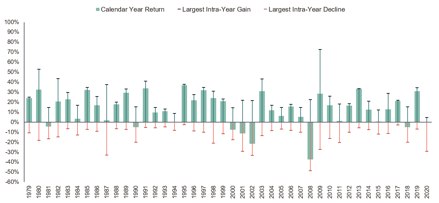

This is a busy graphic, but it tells a great story about the U.S. stock market from 1979 through last week. Each solid bar depicts the market’s annual returns at the end of a calendar year. The “whiskers” above and below each bar represent the biggest highs and lows experienced during the year.
Clearly, intra-year declines happen every year, to varying degrees. What’s more, the decline we’ve seen so far this year is not at all unprecedented in magnitude. We can also see how well markets ultimately have prevailed. Annual returns ended up negative by year-end in only 7 out of 41 years (not counting the current year, since the jury is still out).
Better to Build in Bond Safety Than Flee to It
Another common theme: Panic spurs investors to flee stock market risk and run to bonds.
We can see why that’s tempting. Exhibit 2 shows global asset class returns when monthly U.S. stock returns were at their worst during the 30-year period, 1988–2017.
Exhibit 2: Safe Bonds Can Provide Ballast
Returns During Stocks’ Worst Months, 1988–2017
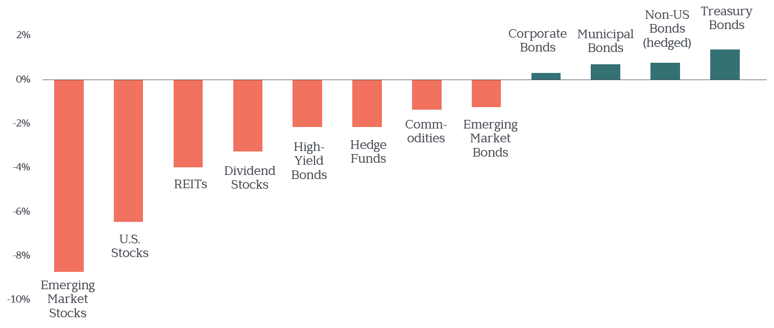
Exhibit 3 displays returns for the same asset classes, for just the most recent three months. This graphic illustrates that this time isn’t different—the safest of bonds have, yet again, served as an important shock absorber for stock market risk.
Exhibit 3: Safe Bonds Can Provide Ballast
Returns During Last 3 Months, January–March 2020
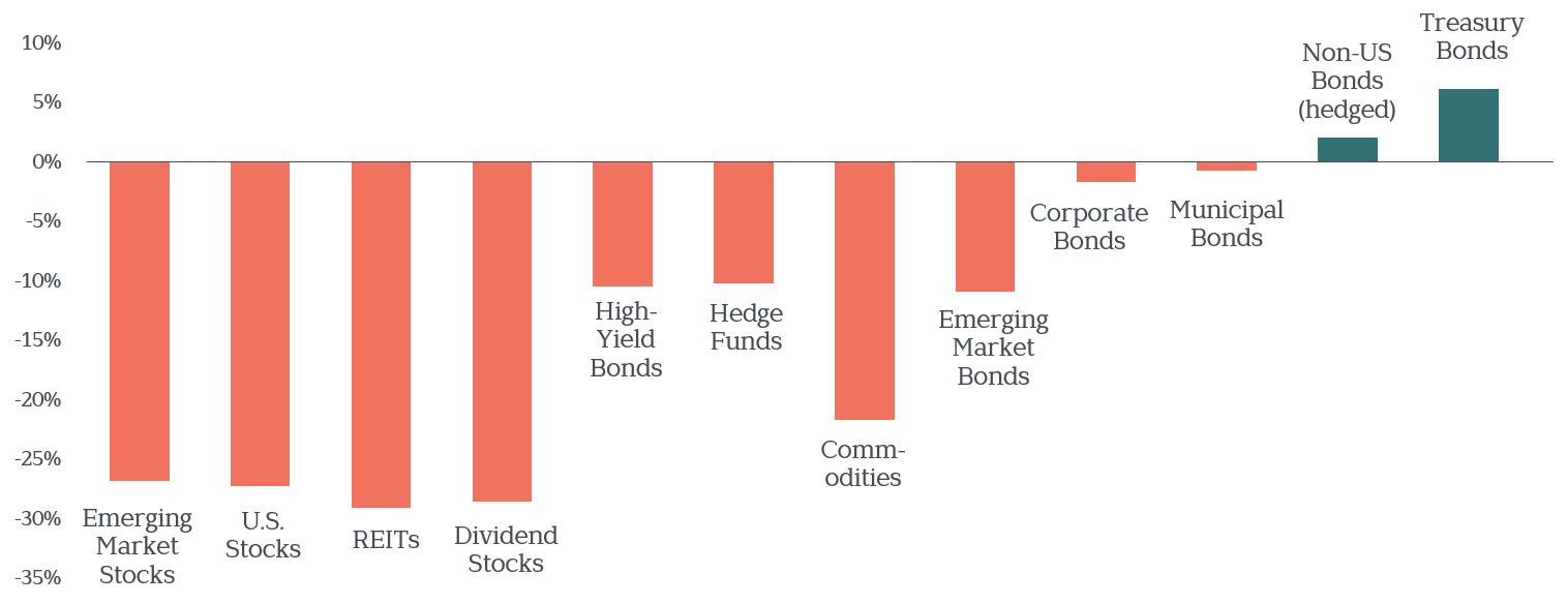
Unfortunately, fleeing to bonds after a crisis has begun—or worse, to oft-hyped “bond replacements” like dividend stocks, hedge funds, or commodities—is like heading for a tornado shelter after they’ve battened down the hatches. Instead of protecting you, you’re left exposed to the elements.
Fortunately, there is a more advisable strategy for times like these…
Rebalancing Can Rev Up Your Recovery Time
We’ve long executed a disciplined portfolio rebalancing strategy, with targets for each asset class in the portfolio. Whenever a target exceeds its maximum/minimum threshold, that tells us it’s time to rebalance by paring back overweight assets (selling high) and adding to your underweight ones (buying low).
Rebalancing is not only a prudent, buy low/sell high strategy, it returns your portfolio mix back to the agreed-upon plan. That way, when markets recover, you have the full complement of expected stock returns you’ve planned for to combat inflation, fuel future spending, and grow your wealth.
Here’s an illustration to suggest what a difference this can make.
Exhibit 4: Recovery Time
Rebalanced vs. Non-Rebalanced
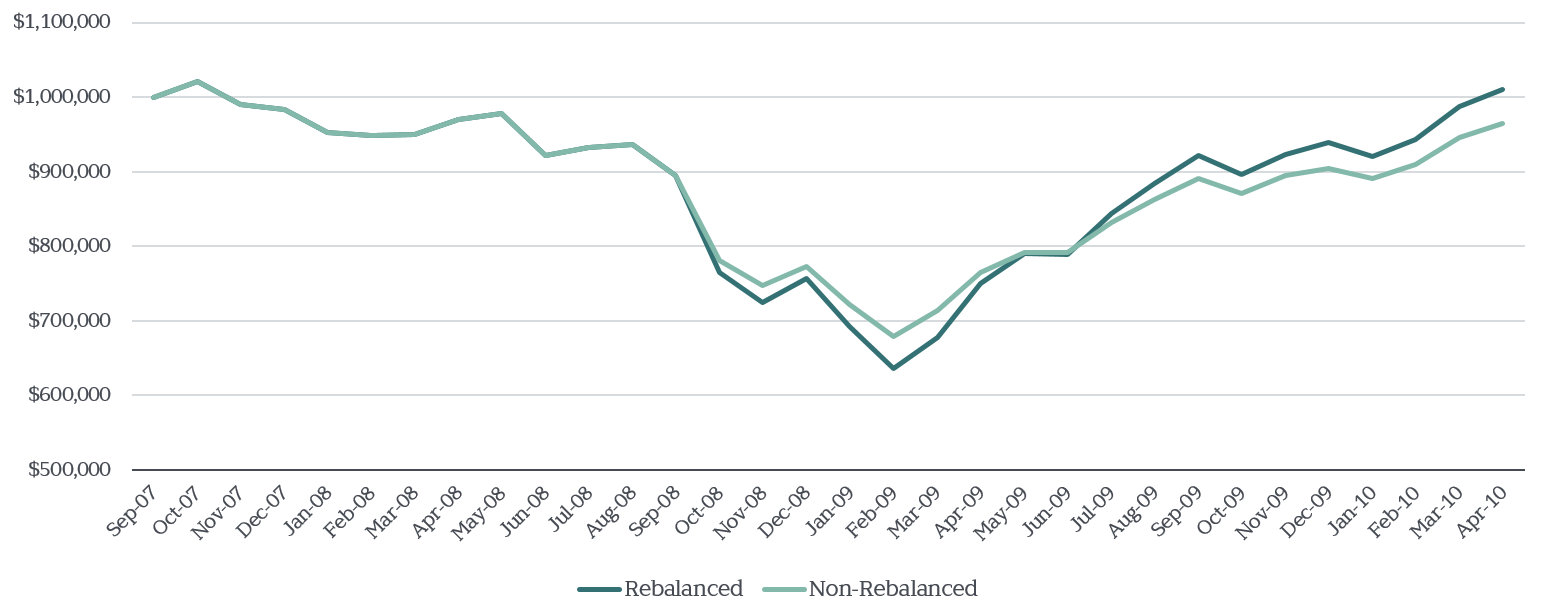
The darker line depicts a globally diversified $1 million portfolio. From the February 2009 bottom of the last bear market, this simulated and dutifully rebalanced portfolio took 14 months to recover. The same portfolio, with rebalancing removed, took 8 months longer to reach the same point.
You Can Only See a Market Recovery in Hindsight
The late Jack Bogle said it well: “The idea that a bell rings to signal when investors should get into or out of the stock market is simply not credible.” In fact, not only is there no dependable recovery-time “bell,” the loudest signals are often dead wrong.
Consider the Time magazine covers below. For years after the market bottomed, the news was still bad. While we appreciate the natural urge to sit on the sidelines, these covers show the enormous cost to waiting for an all-clear signal. By the time you see it (if you ever do), stocks have already moved higher… but without your money in it.
Exhibit 5: Waiting for a Sign?
Stocks May Rise Amidst Bad News
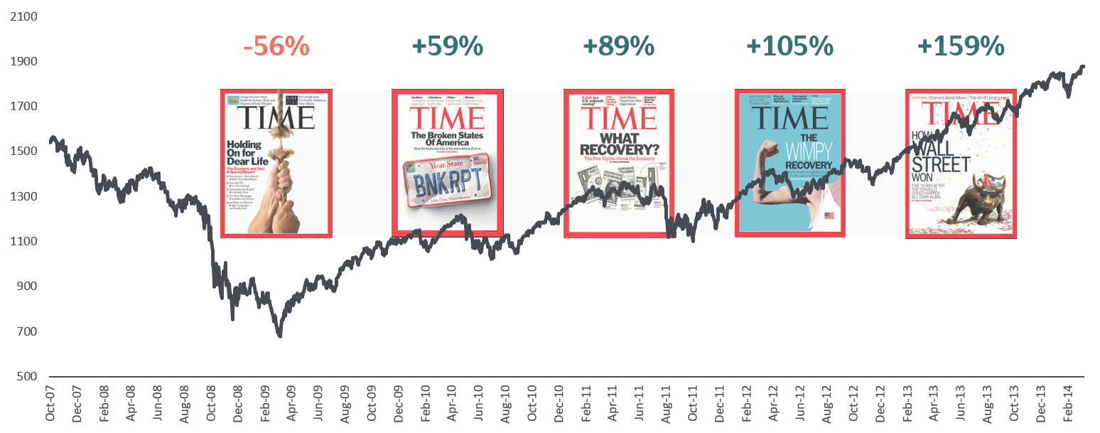
Remember, today’s prices reflect the expectation that news will be negative for some time. If history is any guide, stocks will move in a positive direction long before the news does.
We Advocate for Optimism
So where does this leave investors? Disappointed and shaken by the market’s swift decline, no doubt. But we cannot let the sting of our current reality blind us to a simple and well-documented truth of investing: When current stock prices are lower, expected future returns are higher.
Exhibit 6: Reasons for Optimism
Market Response to Crisis, 1929–2019
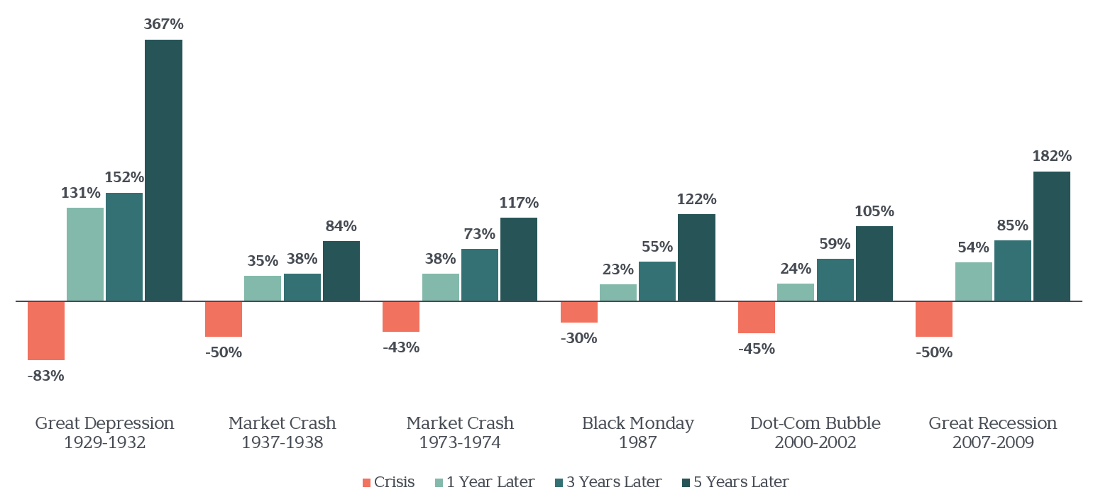
These and other essential insights from past bear markets don’t guarantee a desirable outcome this time. Nor do they help us predict how long it will take before we see a recovery. But we believe controlling what you can—your asset mix, your costs and behaviors—is your best shot for capturing the attractive long-term returns markets have historically offered.
From all that we’ve seen through the years, markets do recover. Capitalism recovers. Our human spirit and ingenuity recover. We expect this time will be no different.
We shared all this and more on a recent webinar. If you missed it, check it out below.
Chart Sources
Exhibit 1: In US dollars. Data is calculated off rounded daily returns. US Market is the Russell 3000 Index. Largest Intra-Year Gain refers to the largest market increase from trough to peak during the year. Largest Intra-Year Decline refers to the largest market decrease from peak to trough during the year. Frank Russell Company is the source and owner of the trademarks, service marks, and copyrights related to the Russell Indexes. Past performance is not a guarantee of future results. Values change frequently and past performance may not be repeated. There is always the risk that an investor may lose money. Indices are not available for direct investment. Their performance does not reflect the expenses associated with the management of an actual portfolio. Past performance is not a guarantee of future results. Values change frequently and past performance may not be repeated. There is always the risk that an investor may lose money. Even a long-term investment approach cannot guarantee a profit.
Exhibit 2: Vanguard. Median return for various asset classes during the bottom 10% of monthly U.S stock returns, 1988-2017. U.S. stocks represented by Dow Jones Wilshire 5000 Index from 1988 through April 2005, and MSCI US Broad Market Index thereafter. Non-U.S. bonds represented by Citigroup World Government Bond Ex-U.S. Index from 1988 to January 1989 and Barclays Global Aggregate ex-USD Index thereafter. Emerging-market stocks represented by FTSE Emerging Index and emerging-market bonds by Barclays Emerging Markets Tradable USD Sovereign Bond Index. REITs represented by FTSE NAREIT Equity REIT Index, dividend stocks by Dow Jones U.S. Select Dividend Total Return Index, commodities by S&P GSCI Commodity Index, high-yield bonds by Barclays U.S. Corporate High Yield Index, hedge funds by median hedge fund-of-funds return as identified by Morningstar, Inc., corporate bonds by Barclays U.S. Corporate Investment Grade Index, Treasury bonds by Barclays U.S. Treasury Index, and municipal bonds by the Barclays Municipal Bond Index. The Dow Jones U.S. Select Dividend Index starts in January 1992; Bloomberg Barclays EM USD Aggregate Index starts in January 1993; hedge fund data start in 1994 and Bloomberg Barclays Global Aggregate ex USD Bond Index starts in January 1990.
Exhibit 3: Vanguard and YCharts. Total returns from 12/31/2019 – 03/16/2020. US stocks represented by Vanguard Total Stock Market Index Admiral Fund, Emerging Markets represented by Vanguard Emerging Markets Stock Index Admiral Fund, REITs represented by Vanguard Real Estate Index Admiral Fund, Hedge Funds represented by IQ Hedge Multi-Strategy Tracker ETF, Dividend Stocks represented by Vanguard High Yield Dividend Index Admiral Fund, High Yield bonds represented by Vanguard High-Yield Corporate Admiral Fund, Commodities represented by Vanguard Commodity Strategy Admiral Fund, Corporate Bonds represented by Vanguard Intermediate-Term Corporate Bond Index Admiral Fund, Municipal Bonds represented by Vanguard Limited-Term Tax-Exempt Bond Admiral Fund, Non-US Bonds represented by Dimensional World ex-US Government Bond Fund, Treasury Bonds represented by Vanguard Intermediate-Term Treasury Index Admiral Fund.
Exhibit 4: Assumes $1,000,000 portfolio invested 65% in stocks, 35% in bonds. Stock portion allocated 60% to US stocks, 30% to International stocks and 10% to REITS as follows: US—43% Fama French US Large Value Research Index; 23% Fama French US Large Growth Research Index; 22% CRSP Deciles 6-10 Index; 12% Fama French US Small Value Research Index. International—30% Fama French International Value Index; 20% Fama French International Growth Index; 20% Dimensional International Small Cap Index; 12% Fama French Emerging Markets Value Index; 8% Fama French Emerging Markets Growth Index; 10% Fama French Emerging Markets Small Cap Index. REITS—100% Dow Jones US Select REIT Index. Bonds—100% Bloomberg Barclays U.S. Treasury Bond Index Intermediate. Assumes portfolio invested October 1, 2007 through April 2010. Rebalancing occurs anytime a target asset allocation for US, International, REITs and/or Bonds deviates by more than +/- 20% from its target. Assumes no taxes. For illustration purposes only. Past performance is not a guarantee of future results.
Exhibit 5: S&P 500 Index. Selected images for illustration purposes only.
Exhibit 6: S&P 500 Index.